I decided to look at the album cover for Halsey's Badlands album. I chose this cover because of the pink and blue colour scheme. I really like the way the the bright blue turquoise contrast with the light baby pink and how there are actually only two colours in the entire cover.
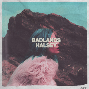
I also really like the contrast between the harsh rock in the background and the soft float material of the coat that she is wearing. I also really like the way the outside frame of the cover is like ripped paper or a type of Polaroid frame.
When making my own album cover I am going to use the blue and pink colours, I also really like the bold font that has been used also. I want to try to incorporate the boldness in my font and the lightness through the use of the colours.
No comments:
Post a Comment