Tuesday, 20 December 2016

Magazine Advert Research

In order to research for my Magazine advert, I used google to find a range of different magazine music adverts from a variety of artists.
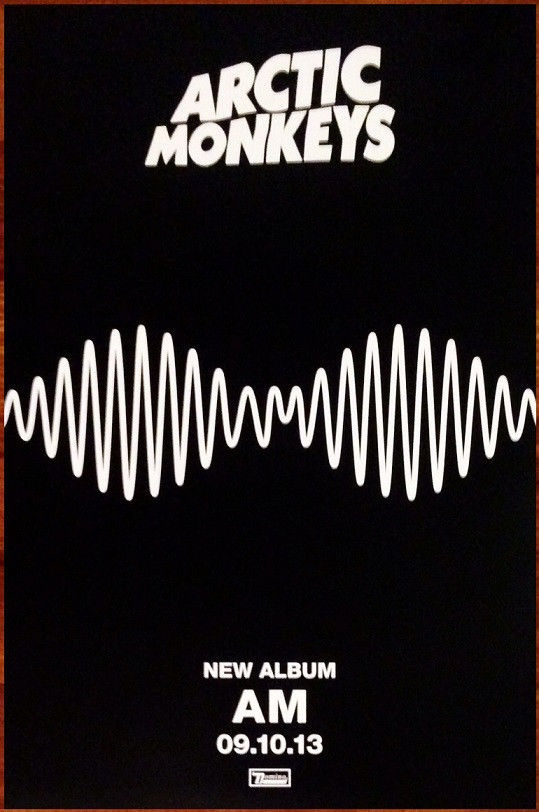
They are all very different, and have their own unique themes and images. As you can see from all of the adverts, they are all enlarged/elongated images of the album cover of the artist. This highlights the need to make a clear link between the CD and the advert.


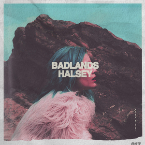
Another thing that I noticed, was the only advert with the artist on the front was the Lana Del Rey one. She is front and centre in the shot, just like on her album cover, and this makes it clear that she is the artist. However the other three have interesting images on the front, which draw people's attention.


They all also have extremely bold font, that again helps to catch the attention of the public and instantly sell the music through the use of the artists name and their clear and established brand.

Image result for album advert

I really like all of these adverts and I am going to try and include some of these features in my own advert. I am going to use the album cover (or an image from the music video) as the main image in the advert, but without the use of the artist in my ad. I want to carry on with the theme of Polly just being a voice, and have the girl in the music video as the face of this CD.

Thursday, 8 December 2016

Planning: Album Cover

This is my initial cover idea, I want the girl in the music video to be shooting the paint cannon around her, with the title of the album hidden in the smoke. I really like this idea, and think it will go really well with the music video and the colour scheme.

Thursday, 1 December 2016

Analysing an Album Cover

I decided to look at the album cover for Halsey's Badlands album. I chose this cover because of the pink and blue colour scheme. I really like the way the the bright blue turquoise contrast with the light baby pink and how there are actually only two colours in the entire cover.

Halsey - Badlands.png

I also really like the contrast between the harsh rock in the background and the soft float material of the coat that she is wearing. I also really like the way the outside frame of the cover is like ripped paper or a type of Polaroid frame. 

When making my own album cover I am going to use the blue and pink colours, I also really like the bold font that has been used also. I want to try to incorporate the boldness in my font and the lightness through the use of the colours.

Friday, 25 November 2016

Album Covers


When thinking about my favourite kinds of CD covers, I chose a wide range of examples to use as inspiration for my own. From this group you can see very plain and minimal covers in comparison to covers with or without the artist on.
From looking at this group I decided that I wanted a fairly minimal cover but with small pops of colour. I also decided that I wouldn't have Polly (my artist) on the frontcover due to her not being in my music video.
A lot of these album covers don't relate to the music videos because they represent a full album, however for the EP cover for 'They Are' I decided that I wanted to use graphics from the music video in the cover to keep up with the bright and pastel motif throughout. I am also doing this so that my three products are completely cohesive.

Friday, 18 November 2016

Post-Production: Bloopers


These are the outtakes from my music video shoot for the song 'They Are'.

Saturday, 12 November 2016

Post-Production: Editing

Here are a few screenshots from the editing process of my music video, as you can see I used a number of straight cuts between clips, as well as overlapping the sparkle image over the top of my footage. I also used filters on top of the first section of the video, I did this to enhance the melancholy mood the character was in which then changed when she finds the balloon.


These screenshots are of the footage I took. As you can see from the orange lines, I didn't use a lot of the footage I had. This was partly because there were aspects of these clips, I was unhappy with, but also because I had filmed a lot more than I had actually needed. This amount of footage, therefore made it easy for me to pick out the best bits, and have a wide range of choices.


This screenshot below is of the track over the top of my video. I got to a point with editing when I felt that the song was way too long, so I decided to cut a small section out and stick it back together. When watching this back, I was very pleased as you couldn't hear the cut at all.

Sunday, 6 November 2016

Post-Production: Importing the Clips

I am now in post-production so will be starting editing now that I have imported my work onto iMovie. I am using iMovie because it is an easy to use and accessible program that I am extremely used to as I have been using it for many years.

Creating a new movie to start editing my clips.


Importing the media ready for editing.

I had around 100 clips and other media for my film.


Tuesday, 1 November 2016

Equipment needed for filming.

Powder Paint Cannon - 6 Assorted Colours - 30cm - Each
For my video I need 2 Powder Paint Canons. I am going to use the colours Blue and Pink to carry on with the theme for my poster and Digipak. I also chose this option, in case there was a failure with the first paint canon and I had a second one to use.
Image result for foil balloons
I am also using a Pink balloon in my music video, as this is what appears in front of the girl in the video. I want to use the pink to again fit in with the chosen colour scheme of my video, together with with the pink and blue of the paint cannons.

Wednesday, 26 October 2016

Location Images - Part 2

ASHTON COURT

I decided to use Ashton Court as my second location, I did this because I knew that I would be able to easily enhance the colour of the surroundings and really make it pop. The location correlates with the emotions of the character at this point, because she is content and happy, this is reflective of the enchanting atmosphere.
The accessibility was also a great factor.
After taking this picture I decided to use this angle for one of my shots in the trees.

This is where I am going to shoot my paint canon shots.


I really like this shot because of the light of the sky between the trees.


Tuesday, 25 October 2016

Location Images - Part 1

BRISTOL DOCKS

I decided to use Bristol Docks as my first location, mainly due to the overall simple aesthetic of the place but also to emphasise how my character is feeling in the start of the video. The location contrasts with the emotions of the character, because of the discontentment she is feeling against a backdrop of the peaceful and pretty surroundings.
I also wanted to use it because I knew that it would be extremely accessible.
Weather doesn't really matter for this part of the video because it is supposed to be gloomy.


Unsure whether I will use this area of the docks.


Will have to think about the boats and continuity.

Filming location for Cafe. (Am going to use the windows to get Emily to look out of)

Will use the cranes in the background of some shots.

I am also going to use the tram lines for Emily to walk down.


The Docks will be mainly what you can see in the background of the shots.

Saturday, 22 October 2016

Planning: Location choices.

When thinking about my locations, I knew that I wanted to use several different locations to show the contrast between the happy and the sad. I have decided that I am going to use an area of woodland and the docks in Bristol. I am going to take location images, so that I can decide whereabouts I want to shoot, and the way I am going to frame the shots and what angles I am going to use.
I am going to use these two contrasting locations, to enable me to pursue the Alice in Wonderland type idea. This is where the first location is gloomy, and then she goes through the rabbit hole and finds the happy woodlands.

Thursday, 20 October 2016

Planning: Change in Character

I was originally using my friend Elise in my music video, however because she was unable to make filming days I had to use my sister for the video instead. I was lucky that I had someone on standby to be the character in my video, who matched the description of the original idea.

Tuesday, 18 October 2016

Planning: Risk Assessment

Risk
Likelihood out of 5
How to prevent
Fall over
3/5
Make sure that pathways are clear and wear sensible shoes
Hurt by heavy equipment
2/5
Make sure you hold the equipment correctly and use a bag to carry it around so you are causing less danger
Strangled by balloon
1/5
Tie balloon to hand and do not wrap around neck.
Stung by nettles
3/5
Clear pathways when walking through woods and wear appropriate leg wear
Fall in River
1/5
Stay away from rivers edge and wear sensible shoes to prevent slipping
Slip
3/5
Wear sensible shoes and be careful where you step
Damaged Equipment
2/5
Keep equipment out of rain, in a bag and handle with care

Monday, 17 October 2016

Planning: Storyboard Pt2

Second part of my storyboarding for the second half of the music video.